
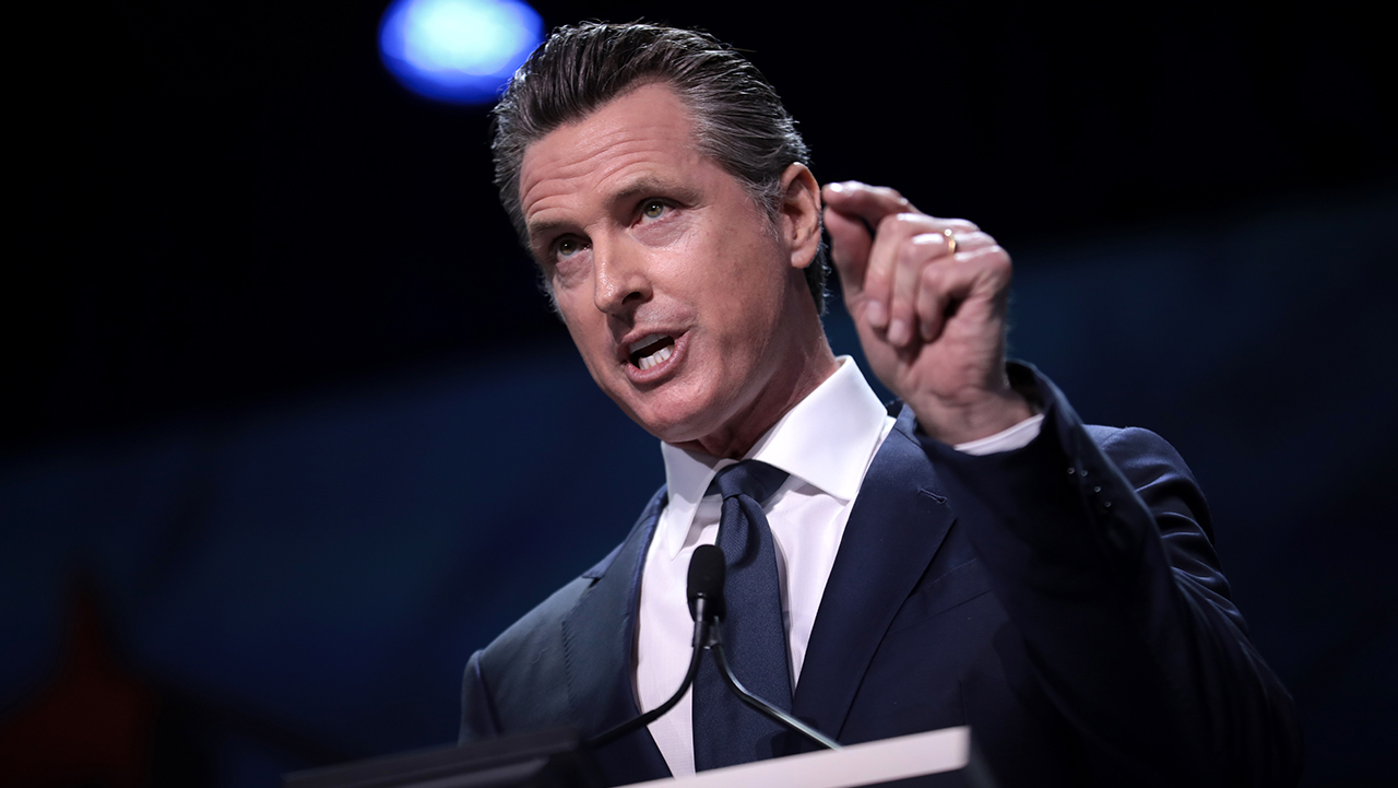
Democrats and Newsom Join the Roast
The Democratic Party, Democrats’ official X account, and California Governor Gavin Newsom’s press office all joined the heated discussion surrounding Cracker Barrel’s rebranding effort. The Tennessee-based chain announced a new text-only logo earlier this week, removing the iconic image of a man leaning against a barrel, which had been a part of its identity since 1977. While the decision had already sparked strong reactions from conservative commentators, Democrats, the Democratic Party, and Newsom’s media team amplified the backlash with satirical posts on social media. Newsom’s press office even mimicked former President Donald Trump’s distinctive, caps-heavy writing style, sarcastically urging the company to restore the old design, while comparing the new look to “cheap Velveeta cheese from Walmart.” These jabs gave the controversy a humorous political twist, fueling viral conversations across platforms.
Also Read : CJI Gavai Questions Governors’ Control Over Elected Governments
Logo Change Sparks Controversy
Cracker Barrel officially unveiled its redesigned logo on Tuesday as part of a broader rebranding campaign intended to modernize the restaurant’s image. The change marks the first time since the late 1970s that the company has deviated from its traditional logo, which featured a rustic illustration of a man resting on a barrel. The new design is stripped down to a simple wordmark, with executives claiming it is easier to adapt across digital platforms, roadside billboards, and storefront signage. However, the move immediately divided customers and brand-watchers. Critics argued that the text-only logo lacked the charm and warmth of the original, with some calling it bland and unmemorable. Social media users piled on with comparisons to processed food packaging and generic grocery branding, arguing that Cracker Barrel had abandoned a key part of its nostalgic identity.
Democrats Criticize, Company Defends Brand Identity
In response to the backlash, Cracker Barrel released a statement reassuring customers that the essence of its brand remains unchanged. Company representatives emphasized that “Uncle Herschel,” a symbolic figure associated with the brand’s hospitality and service, continues to represent its traditions inside restaurants and on menus. They framed the rebranding not as a departure but as the fifth evolution of the logo since Cracker Barrel’s founding in 1969. According to the company, the latest design draws inspiration from the original barrel-shaped wordmark while adapting it for a modern, digital-first world. Executives stressed that the new logo does not erase Cracker Barrel’s history but instead aims to balance heritage with functionality, ensuring the company’s image translates seamlessly across a variety of platforms in today’s marketplace.
Guest Feedback Shapes Transformation
Cracker Barrel’s Chief Marketing Officer, Sarah Moore, explained that the redesign is part of a broader transformation influenced heavily by customer and employee feedback. She revealed that guests frequently expressed a desire for brighter, more inviting dining spaces that feel less cluttered, along with requests for more booth seating and flexible arrangements to accommodate groups of all sizes. By modernizing its physical environment alongside its branding, the company hopes to provide a dining experience that feels both comfortable and relevant to new generations of customers. Moore emphasized that while the logo has been simplified, the brand’s heart remains rooted in hospitality, comfort, and community—the qualities that have defined Cracker Barrel for over 50 years. In the company’s view, the redesign represents an effort to honor tradition while embracing the expectations of contemporary diners.
Also Read : Zakir Khan presents the first Hindi comedy show at the iconic Madison Square Garden.
[…] Also Read : Democrats, Newsom mock Cracker Barrel’s new logo online […]